Interactive Hierarchies - Drowning in rats
It’s been a while since my last blog (turns out moving both job and city requires some effort), but for my glorious return I’ve decided to dive into the world of interactive graphics. In particular I’m going to investigate some alternatives packages that allow us to visualise hierarchical data.
Interactive visualisations within R can be created using htmlwidgets. This specific set of packages brings the a host of interactive JavaScript visualisation libraries to R, without the user needing any prior JavaScript knowledge. Notable htmlwidget packages are:
- Leaflet - The premier JavaScript library for creating interactive maps.
- Plotly - A library that makes interactive, publication-quality graphs and can convert existing ggplot2 objects into interactive graphs.
- networkD3 - A library that offers you the ability to create D3 network graphs.
- DT - an R interface to the JavaScript library DataTables, a great way for displaying tabular data.
So lets get started. The most obvious example that came to me when thinking about hierarchical data, is the manner in which scientists classify living organisms. All organism, with the broadest category at the top and most specific at the bottom, the scheme looks like this:
- Kingdom
- Phylum
- Class
- Order
- Family
- Genus
- species
After some digging around on the web I found Mammal Species of the World, 3rd edition, a database of mammalian taxonomy. You can also download the entire taxonomy as a csv file. So lets start by loading the tidyverse and importing the data,
library(tidyverse)

raw_df <- read_csv("http://www.departments.bucknell.edu/biology/resources/msw3/export.asp")

head(raw_df)
## # A tibble: 6 x 34
## ID Order Suborder Infraorder Superfamily Family Subfamily Tribe
## <int> <chr> <chr> <chr> <chr> <chr> <chr> <chr>
## 1 1.03e7 MONOTR~ <NA> <NA> <NA> <NA> <NA> <NA>
## 2 1.03e7 MONOTR~ <NA> <NA> <NA> Tachygl~ <NA> <NA>
## 3 1.03e7 MONOTR~ <NA> <NA> <NA> Tachygl~ <NA> <NA>
## 4 1.03e7 MONOTR~ <NA> <NA> <NA> Tachygl~ <NA> <NA>
## 5 1.03e7 MONOTR~ <NA> <NA> <NA> Tachygl~ <NA> <NA>
## 6 1.03e7 MONOTR~ <NA> <NA> <NA> Tachygl~ <NA> <NA>
## # ... with 26 more variables: Genus <chr>, Subgenus <chr>, Species <chr>,
## # Subspecies <chr>, TaxonLevel <chr>, `Extinct?` <chr>,
## # OriginalName <chr>, ValidName <chr>, Author <chr>, Date <int>,
## # ActualDate <int>, CitationName <chr>, CitationVolume <chr>,
## # CitationIssue <chr>, CitationPages <chr>, CitationType <chr>,
## # TypeSpecies <chr>, CommonName <chr>, TypeLocality <chr>,
## # Distribution <chr>, Status <chr>, Synonyms <chr>, Comments <chr>,
## # File <chr>, SortOrder <chr>, DisplayOrder <chr>Ok so we’ve got a dataframe of 13582 different species of mammals, with different columns for different levels of the hierarchy, such as Order and Family. The nomenclature consists mainly of Latin, which isn’t something that means a lot to me. Luckily there is a column of common_names, so I’m going to use this variable instead of species. I’ll filter down to those species which are neither extinct and also have a entry in common_names. If I had more domain knowledge, this isn’t the route I would take, but as I want to explore the data, Giraffe conveys more meaning than camelopardalis .From previous inspection I also know there are few non UTF-8 characters spread throughout so I’ll correct that too. So with that in mind, lets take a few steps to clean our data.
library(janitor)

tidy_df <-
  raw_df %>%
  # Turn column names into snake_case
  clean_names() %>%
  # Leave only species with common names, that also aren't extinct
  filter(
    extinct == "False",
    !is.na(common_name)) %>%
  # Replace pesky non UTF-8 characters
  mutate(common_name = iconv(common_name, "UTF-8", "UTF-8",sub='')) %>%
  # Leave only the necessary columns
  select(order, family, genus, common_name)

head(tidy_df)
## # A tibble: 6 x 4
## order family genus common_name
## <chr> <chr> <chr> <chr>
## 1 MONOTREMATA Tachyglossidae Tachyglossus Short-beaked Echidna
## 2 MONOTREMATA Tachyglossidae Zaglossus Sir Davids Long-beake~
## 3 MONOTREMATA Tachyglossidae Zaglossus Eastern Long-beaked E~
## 4 MONOTREMATA Tachyglossidae Zaglossus Western Long-beaked E~
## 5 MONOTREMATA Ornithorhynchidae Ornithorhynchus Platypus.
## 6 DIDELPHIMORPHIA Didelphidae Caluromys Derbys Woolly OpossumNow that our data is prepared, lets jump in to our first visualisation. This comes from the collapsibleTree package, which creates Reingold-Tilford tree diagrams using D3.js. We simply pass our data to the collapsibleTree function, and specify the orders of the hierarchy. This collapsible tree diagram is a really powerful visualisation for hierarchy data as you can navigate your way through the entire hierarchy.
library(collapsibleTree)

collapsibleTree(tidy_df, c("order", "family", "genus", "common_name"))
But how about if we want a more visual representation of the different number of species within each order? One way is to scale the node size per the number of children.
collapsibleTree(tidy_df, c("order", "family", "genus", "common_name"), nodeSize = "leafCount")However the result for this particular dataset is not the most useful…
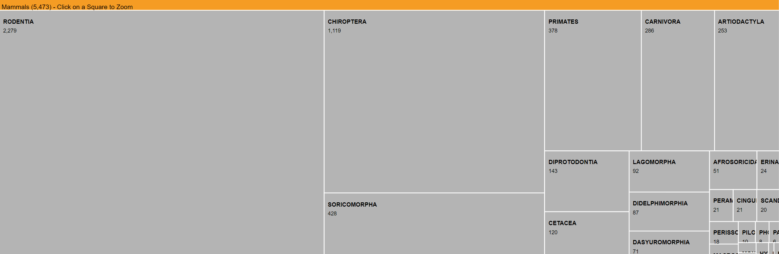
So now we turn to our next package, the developing package d3tm, which has been built by a colleague of mine. This package allows you to create interactive treemaps in d3.js.
You can install the package with the following code:
devtools::install_git("https://gitlab.com/lajh87/d3tm")Now we have the package installed we can create the visualisation. Treemaps require a value to size the rectangles, so let’s create a dummy count column that gives us the number of species.
library(d3tm)

tidy_df %>%
  # Create count of species column
  add_count(common_name) %>%
  # Column named n causes error, so rename to count
  rename(count = n) %>%
  # Turn data into JSON format
  d3_nest2(value_col = "count", root = "Mammals") %>%
  ztm()
This diagram gives a more stark view, and we can instantly see how rodents are by far the biggest order of mammals. We can click through this treemap and find out within the Rodentia order, within which Muridae is the largest family, within which Rattus is the largest genus. Upon opening the Rattus genus we discover 66 different species of rats, like the Timor Forest Rat and the Roof Rat! This isn’t quite the ideal use for this visualisation, as in the final tier, each species has a count of 1, but I wanted to understand what species made up each genus.
One final visualisation for hierarchical data is the sunburst diagram, from the sunburstR package. It isn’t really a good fit for this dataset, but lets have a look anyway.
library(sunburstR)

tidy_df %>%
  add_count(common_name) %>%
  rename(V2 = n) %>%
  mutate(common_name = str_remove(common_name, "-")) %>%
  mutate(V1 = paste(order, family, genus, common_name, sep = "-")) %>%
  select(V1, V2) %>%
sunburst()That’s a wrap for this blog. I haven’t touched how to deal with hierarchical data within this blog, merely some unusual ways of visualising the data. If do you want to learn techniques for processing the data, I would recommend looking into the data.tree package.