Reanimating the Datasaurus
Whilst browsing twitter last night I came upon this tweet by the currrent author of gganimate:
I've started a gganimate wiki page in order to collect examples. If you want to showcase your animations and help others learn in the process, consider submitting an issue as described on the main page #rstats https://t.co/VrT5IV2izr
— Thomas Lin Pedersen (@thomasp85) August 16, 2018
Now I’ve been experimenting a lot with creating animations with R, and I absolutely love using gganimate . So I thought, what a great opportunity to make a minor contribution back.
So I trialled a few ideas. My first one was actually trying to visualise the results from the last 5 world cups, combining gganimate with geom_sf. This didn’t work out too well… 
So I retreated back into the mind palace and remembered seeing a really cool animation about a year ago of a Datasaurus. A google search later I come across this blog which explains the history behind the ‘Datasaurus Dozen’.
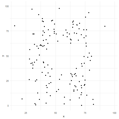
Essentially the Datasaurus Dozen is a playful twist on the classic statistical dataset; Anscombe’s Quartet. The Datasaurus Dozen is a group of twelve datasets, with nigh-identical summary statistics, but when plotted on a graph they prove to be distinctly dissimilar. Imagine my delight when I found the Datasaurus Dozen was available on CRAN in the datasauRus package.
It turned out that creating an animated version of the Datasaurus Dozen was absurdly simple, taking only 4 lines of code.
library(datasauRus)
library(ggplot2)
library(gganimate)

ggplot(datasaurus_dozen, aes(x=x, y=y))+
  geom_point()+
  theme_minimal() +
  transition_states(dataset, 3, 1)
It seems crazy to me that all these datasets have the same means, standard deviations and correlations!
I think this example also displays the brilliance of gganimate and a testament to Thomas’ unwavering focus on the grammar and API of the package. David Robinson summed it up best with “An amazing example of how gganimate lets you accomplish so much with so little.”
I’m not going to lie, I’m also pretty chuffed its now an example on the gganimate github page!! :):)