UK Population Pyramid
On my journey to creating my animated Premier League table in my previous post, I noticed a lot of examples for creating gifs using the magick package. The gist behind the majority of these examples was to create a sequence of snapshots which could be combined together to create animations. Whilst not quite as seamless as gganimate, it appears to be much more versatile.
So I thought I would try and make one. I had a number of ideas, but eventually I stumbled across a FOI request that contained a great dataset containing the population demographics of the UK going back to 1970.
A classic way to visualise this data is by using a population pyramid and my idea of a twist was to add an extra dimension and animate this pyramid over time.
Lets load some packages.
library(readxl)
library(tidyverse)
library(ggthemes)
library(magick)
Now we have all the tools needed. As the data was in a stats publication, it was fairly computer unfriendly, so a fair amount of data wrangling was required. I decided to use the Single Year of Age (SYOA) dataset for the UK 1970 - 2015. This gave a good chunky dataset to work with and yet still covers the entire UK.
data <-
  ## Read the excel data in, skipping the "All Ages" data completely
  read_excel("UK Population Estimates 1838-2015.xls", sheet = 4, skip = 96) %>%
  ## Filter away unnecessary data
  filter(!is.na(Name)) %>%
  filter(Code != "Code") %>%
  filter(Age != "All Ages") %>%
  ## We want a numeric column, so replaced 85 / 85+ with 85
  mutate(Age = ifelse(Age == "85 / 85+", 85, Age)) %>%
  ## We group by age, as it is replicated across the two genders, and we can use this to distinguish one from the other
  group_by(Age) %>%
  mutate(gender = 1:n()) %>%
  mutate(gender = ifelse(gender == 1, "Male", "Female")) %>%
  ungroup() %>%
  ## Gather all the variable columns into one year variable to make this a tidy dataset
  gather(year, pop, 4:48) %>%
  ## Only keep the last 4 characters to give us a year, which we can convert to numeric
  mutate(year = as.numeric(str_sub(year, -4))) %>%
  mutate(age = as.numeric(Age), Age = NULL) %>%
  mutate(pop = as.numeric(pop)) %>%
  ## Make the Male population negative so we can use this in our ggplot
  mutate(pop = ifelse(gender == "Male", 0-pop, pop)) %>%
  mutate(pop_m = pop/10^6)
Now we have a nice tidy dataset of UK population demographics over the past 30 years. Next we need to create a population pyramid from our data. Google gave me plenty of examples to follow but I found this one particularly helpful.
However my first attempt didn’t go so well…

Pyramid Fail
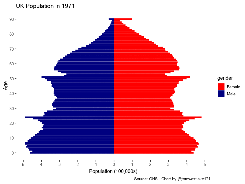
I finally got there however

1971 UK Population Pyramid
Using the following ggplot2 code
data %>%
    filter(year == 1971) %>%
    ggplot(aes(x = age, y = pop_m, fill = gender)) +
    geom_col(width = .85) +
    scale_y_continuous(breaks = seq(-1,1,0.1),labels = c(10:0, 1:10)) +
    coord_flip() +
    scale_x_continuous(breaks = seq(0, 100, 10), labels = seq(0, 100, 10)) +
    labs(title=paste0("UK Population in ", x), y = "Population (100,000s)", x = "Age", caption = "Source: ONS   Chart by @tomwestlake121") +
    theme(plot.title = element_text(hjust = .5),
          axis.ticks = element_blank()) +
    scale_fill_manual(values=c("red", "navy")) +
    theme_tufte(base_size = 12, base_family="Avenir")
After this it was simply a matter of turning this plot code into a function and adding the necessary magick parts! I followed the example found within the magick introduction vignettes, within the animation section
So I must admit, I don’t quite understand all the theory behind this technique yet. But hey it works, its magic! So somehow R knows after I call the image_graph function to remember all the plots I make and then piece them together in order. You then call image_animate which formulates the gif and then save it using image_write when I’m making plots and seems to save them and then. Pretty cool huh. Anyway so you can see the code I used below.
img <- image_graph(800, 600, res = 96)

pyramid_plot<- function(x){
  p <- data %>%
    filter(year == x) %>%
    ggplot(aes(x = age, y = pop_m, fill = gender)) +   # Fill column
    geom_col(width = .85) +   # draw the bars
    scale_y_continuous(breaks = seq(-1,1,0.1),labels = c(10:0, 1:10)) +

    coord_flip() +  # Flip axes
    scale_x_continuous(breaks = seq(0, 100, 10), labels = seq(0, 100, 10)) +
    labs(title=paste0("UK Population in ", x), y = "Population (100,000s)", x = "Age", caption = "Source: ONS   Chart by @tomwestlake121") +
    theme(plot.title = element_text(hjust = .5),
          axis.ticks = element_blank()) +   # Centre plot title
    scale_fill_manual(values=c("red", "navy")) +
    theme_tufte(base_size = 12, base_family="Avenir") #+ transition_manual(year)#
  p
}
map(1971:2015, pyramid_plot)
dev.off()
animation <- image_animate(img, fps = 5)
image_write(animation, "tom-uk-pyramid-5 fps.gif")
And the final product:
Animated UK Population Pyramid
In conclusion, after I got my head around the magic happening and just accepted it, it followed quite a logical process. I particularly like how easy it was to alter parameters such as fps, resolution and the dimensions. These will obviously exist within the gganimate package, I just need to spend more time familiarising myself with the lexicon.
P.S. The keen-eyed among you will notice a weird data anomaly in the 1980s, for the 80-90 age group. This was because the data stopped at 85 years of age within this time period and I fudged a correction into the data to make the animation appear more seamless. The actual animation should look like below, but I found this to be quite jarring:

Alternative Pyramid